Are you running an eCommerce Store?
Is your store generating low sales and you are trying to find the ways to get more sales?
Do you know what is causing you less sales?
There are plenty of reasons that are causing you less sales. It could be the load time, Design, Your website content etc. However, amongst many other reasons one of the main and overlooked reason for low conversions is not having a responsive website.
Now what is a Responsive Website?
Responsive web design (RWD) is a web design approach aimed at crafting sites to provide an optimal viewing experience—easy reading and navigation with a minimum of resizing, panning, and scrolling—across a wide range of devices (from mobile phones to desktop computer monitors) -Wikipedia
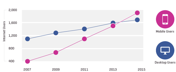
Several research agencies have revealed in their studies that more and more users are shifting to mobile devices for web browsing, online shopping and social networking. Things are just a tap away in the mobile devices and smart-phones . See Image below
So with trends constantly changing and increase in mobile users, e-business owners are somehow forced to develop websites which appear perfect to mobile phone visitors. There are more specific reasons to go responsive, we have enlisted the major points:
Reasons to Have a Responsive Website
1. It is estimated that the sales of PC will go down from this year.
2. Google recommends responsive web design as best practices in web design industry.
3. Data from Google Analytics says – over 60% of web surfers are browsing from Mobile devices
4. Tablet Sales will hit 100 million mark and will leave laptops behind by the end of year 2013.
5. Responsive web designs are ranked on the top 5 eCommerce checklist by Forbes Magazine in year 2013
Ok So Now you know the benefits of having responsive website. So for your store you might be using Magento, WordPress, Shopify, Volusion or any other ecommerce platform. Our experience with our customers has revealed to us that Bigcommerce is the best in creating responsive store, Now let me tell you more about Bigcommerce and its offering.
What a BigCommerce Responsive Designs Offers :
BigCommerce is known for it’s fantastic pricing, strong security features and on the top of everything it has got unbelievably powerful inventory system. If you are one of the merchant who is looking to get the most value out of their investment then there is no other more profitable CMS for your business than BigCommerce.

BigCommerce designs offers an optional template for mobile devices. A merchant can set their website using there mobile layouts. However it will inherit the standardized BigCommerce mobile template. You may also opt to turn off the mobile templates and use custom designs for screens you want to display the website. These designs appear excellent and operate smooth on mobile devices. It would not be the one that is targeted specifically at mobile browsers. It is more beneficial to get your website a custom BigCommerce design which is far more effective than a general mobile layout. You may decide these design plans based on the visitors trends and analytics of your website.
Benifits of BigCommerce Responsive web design :
1. Upgraded Backend : The latest version of BigCommerce offers hundreds of latest features with no extra cost.
2. Fantastic Pricing : As far as e-commerce sites are concerned, Bigcommerce responsive web designs are best investment in comparison to any other shopping cart.
3. Security and Marketing options : BigCommerce offers Hacker-deterrence, provisioning and almost every possible security option for your website. It also offers eCommerce SEO options to increasing visibility in search engine result pages.
4. Perfect Timing : As we have mentioned above, by the end of this year number of tables and mobile devices will go ahead of PC, what will be a better time to encash the features of BigCommerce responsive design as more visitors will be mobile.
So if you interested in a BigCommerce responsive web design for your eCommerce website, feel free to get in touch with 1digitalagency.com and schedule an appointment to get a your eCommerce website custom fixes.
Editorial note (updated): this article originally cited 2013-era projections (PC sales declining "this year," tablets passing laptops "by the end of 2013," a 2013 Forbes checklist). Those specific dated predictions have been removed. The underlying point — that the majority of eCommerce traffic is now mobile and responsive design is mandatory, not optional — has only become more true, and the guidance below is updated to current practice.
Responsive is the floor now, not a differentiator
When this was written, "should we be responsive?" was still a live question. It no longer is: mobile is the majority of eCommerce traffic, Google indexes the mobile version of your site (mobile-first indexing), and Core Web Vitals on mobile are a ranking and conversion input. Responsive design is the baseline expectation. The useful question today is not whether to be responsive but how well the mobile experience actually performs.
What "good responsive" means in practice
- Mobile Core Web Vitals pass: fast loading, responsive interaction, and stable layout on a mid-range phone on a normal connection — not just on a flagship on office wifi.
- Touch-native interaction: adequately sized tap targets, swipeable galleries instead of hover-reveal, and no essential information hidden behind interactions that do not exist on touch.
- A mobile checkout built for thumbs: minimal fields, address autocomplete, digital-wallet one-tap payment, and guest checkout.
- Performance budget: compressed, correctly sized images and deferred non-critical scripts, because mobile networks and devices are less forgiving than desktop.
Where BigCommerce helps with this
BigCommerce's value here is accurate as stated: strong built-in security, competitive pricing, a capable inventory system, and responsive theming with the option of a custom design rather than a generic mobile template. A custom responsive build genuinely outperforms a stock mobile layout because it can be tuned to your catalog and performance budget. As with any platform, the platform removes obstacles — it does not guarantee a fast, well-merchandised mobile experience on its own; that is design and development work.
Frequently asked questions
Is responsive design still enough, or do I need a separate mobile site? A well-built responsive site is the standard approach and avoids the maintenance and SEO complications of a separate mobile URL. The priority is making the responsive build genuinely fast and touch-native, not maintaining two sites.
Does mobile performance really affect rankings? Yes. Google uses the mobile version for indexing and Core Web Vitals are a ranking signal. A slow or unstable mobile experience hurts both rankings and conversion simultaneously.
Is BigCommerce a good choice for a mobile-first store? It is a capable platform with strong responsive theming and security, and a custom design on it can perform very well. The platform is the foundation; the mobile result still depends on the quality of the design and development on top of it.
If your mobile experience is underperforming, see our BigCommerce services and eCommerce web design, or contact us.