
For Dental Practices
Dental Website Design Built to Book Patients
A practice website is a scheduling tool, not a brochure. We design dental sites around the four ways patients actually arrive - routine new-patient search, dental emergency, high-value treatment research, and existing patients handling admin - then build them on WorkspaceCMS so your front desk never waits on a developer. 15 years. 400+ brands. 941+ verified reviews.
The 1Digital® Difference
AI in our toolkit. Humans in the driver’s seat.
Our strategists, designers, developers, and writers are human. The proprietary AI we built makes them faster and sharper - not the other way around.
- Human strategy
- Human copywriting
- Our own AI tools
- Real growth
Trusted by 400+ Brands · Certified Partners




Years in eCommerce
Of results, scale, and quality at the enterprise level.
Expert Team
Specialists across SEO, AI SEO, PPC, design, dev, and strategy.
US Core + Global Talent
US core team for clear communication; vetted global specialists for international client work.
Reputation Score
Rated 4.9/5 across 941+ verified client reviews.
Reviewed by the 1Digital® Design TeamLast updated:
Start Here
You Don’t Need a Platform. You Need a Site That Fills Chairs.
Most agency web-design pages are organized around software - Shopify, Magento, WordPress. That framing is useless to a practice owner. A dentist is not shopping for a content management system; they are trying to convert the person who just typed “dentist near me” at 9:40 p.m. into a Tuesday-morning appointment. So this page is organized around the job instead: what a dental website has to accomplish, how the good ones do it, and why the bad ones quietly leak patients for years without anyone noticing.
Because a practice sells appointments rather than products, the right destination is a managed content platform, not a storefront. We build dental sites on WorkspaceCMS - our own platform, designed, built, and supported by the same 1Digital® team that has been shipping conversion-led design since 2012. There is no cart to maintain, no plugin stack to patch, and no developer ticket queue between your office manager and a corrected set of holiday hours.
Dental website design, step by step
A practice site that fills the schedule
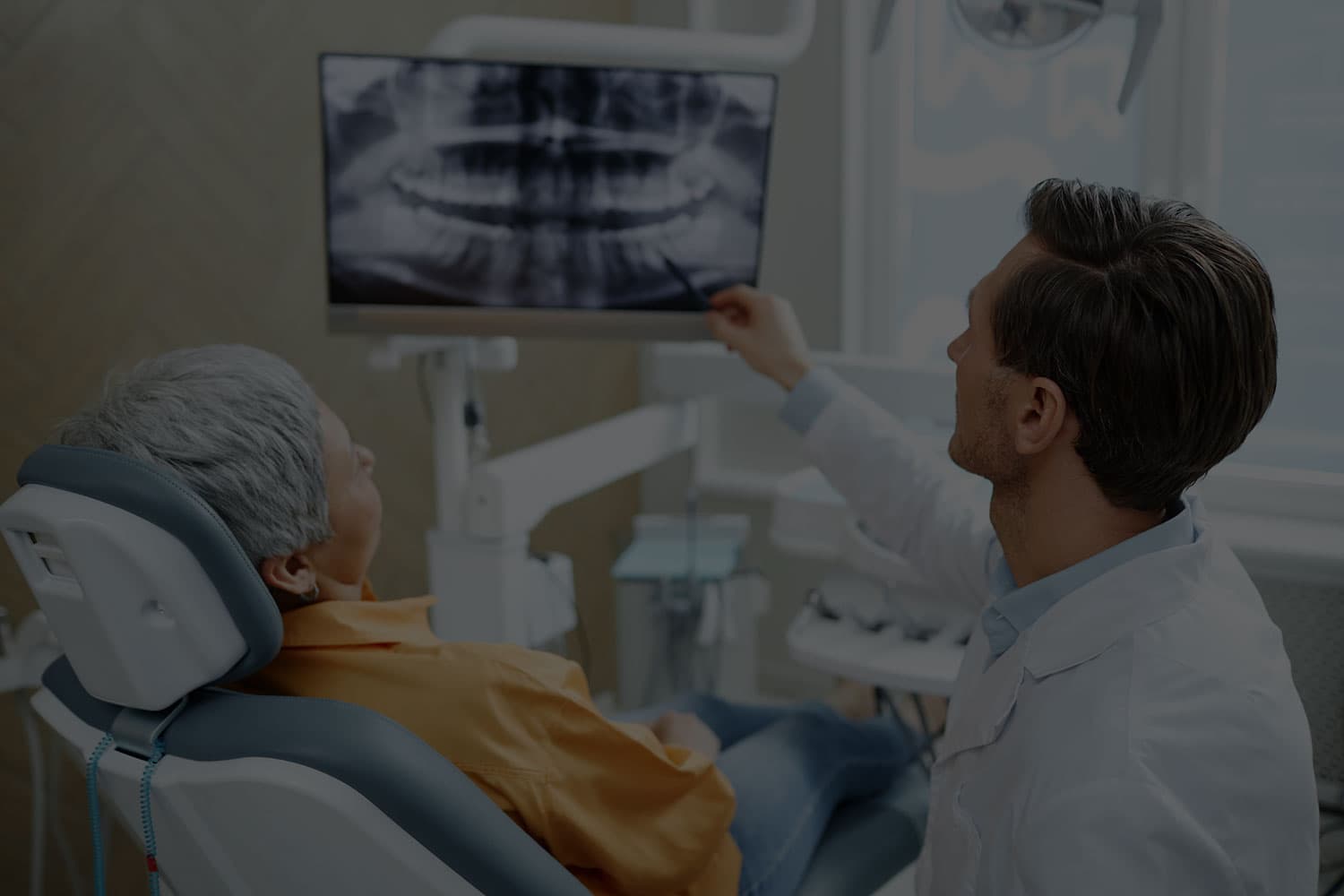
A dental site needs to answer the questions patients ask before they call: what you treat, who they will see, whether you take their insurance and how to book. The layout is planned around those answers first, then designed to feel calm and welcoming.
- ›Services, team and insurance easy to find
- ›Booking and calling one tap away on a phone
- ›A design that puts nervous patients at ease
The Four Conversion Paths a Dental Site Must Serve
Nearly every visitor to a dental website is on one of four errands. They want different things, arrive in different emotional states, and need different page structures. Designing one generic “Contact Us” funnel for all four is the single most common failure we see.
- Path 1
The routine new patient
Someone moved, changed jobs, or finally scheduled the cleaning they have been postponing. They are comparison shopping, and their decisive questions are boring and practical: do you take my insurance, are you accepting new patients, how far is parking, and does the office look like somewhere I want to sit for an hour. This path needs a new-patient page that answers insurance and financing plainly, a real photo set of the actual office and actual team, and a booking action that never requires the visitor to compose an email.
- Path 2
The emergency
A cracked tooth, a lost crown, sudden pain. This visitor is in discomfort, usually on a phone, often outside business hours, and will not read anything. They need a phone number that is tappable above the fold on mobile, an unambiguous statement of whether you handle same-day emergencies, and today’s actual hours - not a generic weekly grid that says “9-5” on a holiday when you are closed. Emergency intent punishes design that prioritizes elegance over immediacy.
- Path 3
The high-value treatment researcher
Implants, full-arch restoration, veneers, clear aligners. This is a considered purchase with a long research window, frequently involving a spouse or an adult child, and it is where practice revenue concentrates. These visitors want procedure explanations written for a layperson, an honest account of the process and recovery, the credentials and case experience of the specific clinician, financing options, and before/after evidence. One paragraph on a services page will not close this person. Each major treatment deserves its own page.
- Path 4
The existing patient doing admin
Paying a bill, downloading new-patient forms, checking whether you are open Friday, or finding the portal login. This traffic converts nothing directly, but if the site makes these tasks hard, it makes your front desk answer the phone instead - and a busy phone line is a lost new-patient call. Good dental design treats self-service as a first-class objective and keeps it visually separate from acquisition content so the two audiences never compete for the same real estate.
How Bad Dental Websites Actually Fail
Failure is rarely dramatic. The site looks fine in a screenshot and still underperforms for years. The recurring patterns:
- Stock photography of other people’s teeth.Patients are choosing a person to put hands in their mouth. Generic smiling models signal the opposite of the specific, local trust the decision requires - and every competitor in town licensed the same library.
- Insurance information buried or absent.This is often the first question and the fastest disqualifier. Hiding it does not prevent the mismatch; it just moves the disappointment to a phone call your team has to take.
- A booking widget that is the only way to book.Third-party schedulers help, but when the embed is slow, blocked, or broken on an older phone, there must still be a visible phone number. Never make the appointment depend on one script loading.
- One page for twelve services.A single “Services” page listing implants beside cleanings gives search engines nothing to rank and gives the implant researcher nothing to read.
- Content nobody can update.Hours change, associates join, a hygienist leaves, insurance participation changes. If every edit is a support ticket with a lead time, the site drifts out of date - and stale hours and stale staff pages are exactly the details patients use to judge whether a practice is well run.
- Heavy hero video with no accessible fallback.Practices are a frequent target of web-accessibility demand letters. Contrast failures, unlabeled form fields, keyboard traps, and video without captions or reduced-motion handling are both a legal exposure and a real barrier for the older patients who make up much of restorative demand.
The Page Architecture We Build
Structure is where dental design differs most from ecommerce. There is no catalogue to merchandise; there is a small set of high-intent pages that each have to do one job completely.
Home
Who you are, where you are, what you treat, whether you are accepting new patients, and two paths out - book, or call.
One page per treatment
Implants, cosmetic, orthodontics and aligners, endodontics, periodontics, pediatric, sedation, emergency. Written for patients, not for the ADA code book.
Clinician profiles
A real page per dentist and specialist - education, memberships, years in the community, and the procedures they personally perform. This is the page high-value researchers read last before calling.
New patients
What the first visit is like, forms, insurance participation, financing, and what to bring.
Location pages, one per office
Distinct address, distinct phone, distinct hours, embedded map, parking and transit detail, and the team who work there. Multi-site groups that reuse one page across every office compete with themselves.
Patient resources
Forms, billing, portal, post-op instructions - the self-service lane that keeps the phone free.
On mobile, we keep the tap-to-call and book actions persistent, keep forms short enough to complete one-handed, and design the whole thing responsively from the phone up, since that is where emergency and evening traffic lives.

Why the details matter
“Patients are choosing a person to put hands in their mouth.”
The real office, the real team, and today’s real hours are the details patients use to judge whether a practice is well run.
The platform behind the build
See the Plan That Turns a Site Into a Booking Tool
Everything above - treatment pages that stand on their own, hours a front-desk manager can correct the morning of a holiday, a booking path that never depends on one embed loading - runs on the WorkspaceCMS Growth plan. This short tour walks what that plan includes and how updates reach the live site, so you can judge the platform before you talk to us about the design.
Built on
What That Architecture Looks Like, Built
Three live WorkspaceCMS demos from adjacent care categories. Each one is the structure above made concrete - a booking path in reach from every screen, treatment detail given its own room, and pages an office manager can edit without opening a support ticket.
- dent.workspacecms.ai
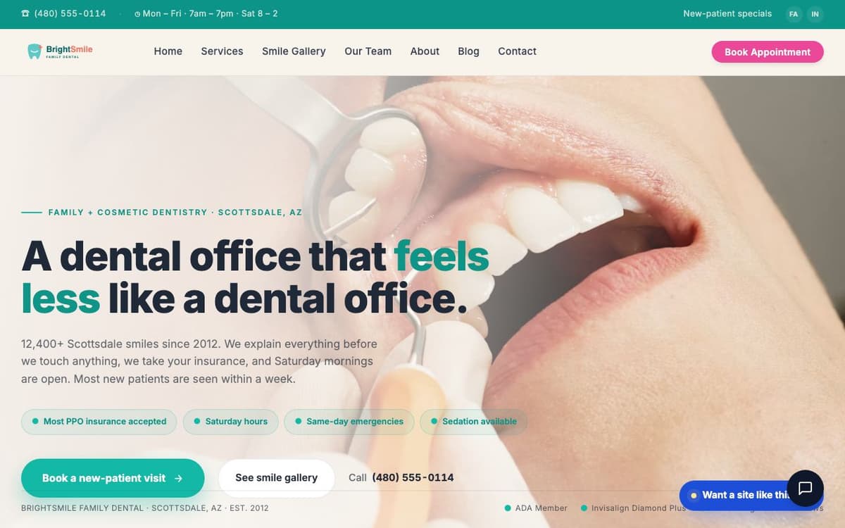 View the live demo →
Brightleaf Dental
Booking and today's hours in reach on every page, with insurance answered up front
- medspa.workspacecms.ai
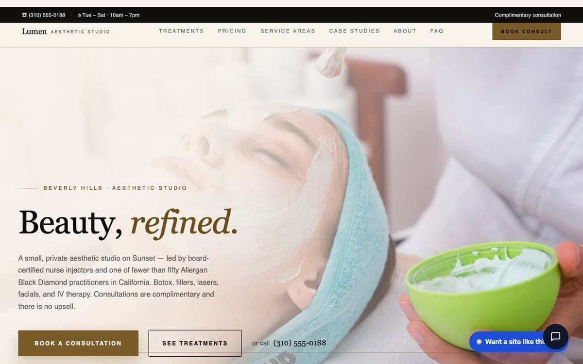 View the live demo →
Lumen Aesthetics
Before-and-after gallery treatment for elective, high-consideration procedures
- vision.workspacecms.ai
 View the live demo →
Clearview Optical
Clinical and retail in one site - exams and clinician profiles beside a product catalogue
Trust Signals and the Compliance Constraints Around Them
Dentistry is a trust purchase governed by rules that do not apply to retail. The strongest trust assets are also the most regulated, so design has to accommodate the constraint rather than discover it after launch.
Before-and-after galleries are the highest-converting element on a cosmetic or orthodontic site, and they use patient images. Under the HIPAA Privacy Rule, marketing use of patient information generally requires a specific written authorization that is separate from consent to treat. We design galleries that assume an authorization workflow exists - per-case records, the ability to withdraw an image quickly, and layouts that stay visually intact when a case has to be pulled. Confirm your authorization language with your own compliance counsel; we build the site to fit it.
Reviews and testimonials are similar. A public reply that confirms someone was a patient, or what was done, discloses protected information. Design decisions follow: we pull ratings and review counts into layouts that display well without editorializing on individual cases, and pair the site with reputation management so responses stay in a compliant voice.
Forms and tracking are the third constraint. Any field where a patient might describe a symptom is potentially protected information, which affects where the form posts, which vendors you use, and whether a Business Associate Agreement is required. Marketing tags and session-recording tools need the same scrutiny. We keep intake fields minimal and route them deliberately rather than dropping in whichever embed is convenient.
Accessibility we treat as non-optional. Every build targets WCAG 2.2 AA - contrast, keyboard operability, focus states, semantic structure, labeled fields, and reduced-motion handling for background video. See our ADA compliance practice for how we audit and remediate.
Where Design Decisions Become Local SEO and AI Visibility
Dental search is local search. A practice competes inside a radius, so the map pack and the “near me” result matter more than national ranking ever will - and several of the levers are design decisions, not afterthoughts an SEO bolts on later.
- ›Name, address and phone rendered as text. If your contact block is baked into an image or injected by a script, it is harder for crawlers and answer engines to read and reconcile against your Google Business Profile. We render it as real markup on every page.
- ›Structured data that matches the layout. Dentist, Physician, LocalBusiness, opening hours, service and area-served markup should describe what is visibly on the page. Schema that contradicts the design is worse than no schema.
- ›A page per treatment per location. Ranking follows specificity. There is no way to rank for “dental implants” in a given suburb from a bullet on a combined services page.
- ›Answer-shaped content blocks. AI assistants and AI Overviews cite pages that state answers plainly - whether you take a given plan, whether you see children, whether you offer sedation, what a consultation involves. Question-and-answer sections and short declarative paragraphs are extractable; long undifferentiated marketing prose is not.
- ›Speed and stability on a phone. Core Web Vitals are a design budget. Image weight, font loading, and the number of third-party embeds are decided in the mockup, not in a performance sprint afterwards.
The site is the foundation; the demand program sits on top. Pair it with local SEO, dental marketing services for Local Services Ads and profile work, or dental PPC when you need volume faster than organic can deliver. If your needs run past a practice site into a fully bespoke build, see custom website design.
Introducing
Your Industry. Your CMS. Managed for You.
- Unlimited managed edits - shipped on your plan's SLA
- SEO baked into every page, post, and location
- Technical SEO on every plan; AI schema and internal linking on Premium & Ultra
Request a proposal
Tell us about your practice
Share your locations, specialties, and which treatments you want to grow. A senior strategist replies within one business day with a pricing band and a draft site map.
Dental Website Design - FAQ
What platform should a dental practice use?
A practice sells appointments, not products, so an ecommerce platform is the wrong shape - you would maintain a cart, catalogue, and checkout you never use. We build dental sites on WorkspaceCMS, our own managed content platform, so the pages a practice actually needs (treatments, clinicians, locations, new-patient information) are first-class, and routine edits like hours, insurance participation, and staff changes go through your team rather than a development queue.
How many pages does a dental website need?
More than most practices launch with. Plan on a home page, one page per treatment you want to be found for, one profile page per dentist and specialist, a new-patient page covering insurance and financing, a patient-resources area, and a separate location page for each office. Consolidating treatments onto a single services page is the most common structural mistake - it leaves nothing specific to rank and nothing substantial for a high-value treatment researcher to read.
Can we publish before-and-after patient photos?
They are among the most persuasive assets on a cosmetic or orthodontic site, and they carry a compliance requirement: under the HIPAA Privacy Rule, marketing use of patient images generally requires a specific written authorization separate from consent to treat. We design galleries that assume that workflow - per-case tracking, fast removal if an authorization is withdrawn, and layouts that hold up when a case is pulled. 1Digital® is a marketing and design agency, not a HIPAA compliance consultant; confirm your authorization language with your own compliance counsel.
How should the site handle dental emergencies?
Treat emergency as its own conversion path. That means a tappable phone number visible above the fold on mobile, an explicit statement of whether you accept same-day emergencies and during what hours, accurate current hours including holiday exceptions, and a dedicated emergency page that loads fast on a weak connection. This visitor is in pain and will not scroll, read, or fill out a form.
Does website design affect local rankings and AI answers?
Directly. Contact details rendered as real text rather than baked into an image, structured data that matches what is visibly on the page, a separate page per treatment per location, and plainly stated answers to the questions patients ask are all design decisions that determine what search engines and AI assistants can extract and cite. Page weight and layout stability on a phone are likewise decided in the mockup, not remediated afterwards.
We have multiple offices. How does that change the build?
Each office gets its own location page with its own address, phone number, hours, map, parking detail, and the clinicians who practise there - never one shared page with a location switcher, which makes your offices compete for the same query. Treatment pages are then cross-linked to the locations that offer them, so a group with different service mixes per office is represented accurately instead of promising every procedure everywhere.
Let’s Talk
A Practice Website That Earns Its Keep
Design, build, accessibility, structured data, and a managed platform your team can actually run - from the agency that builds WorkspaceCMS. 15 years. 400+ brands. 941+ verified reviews.