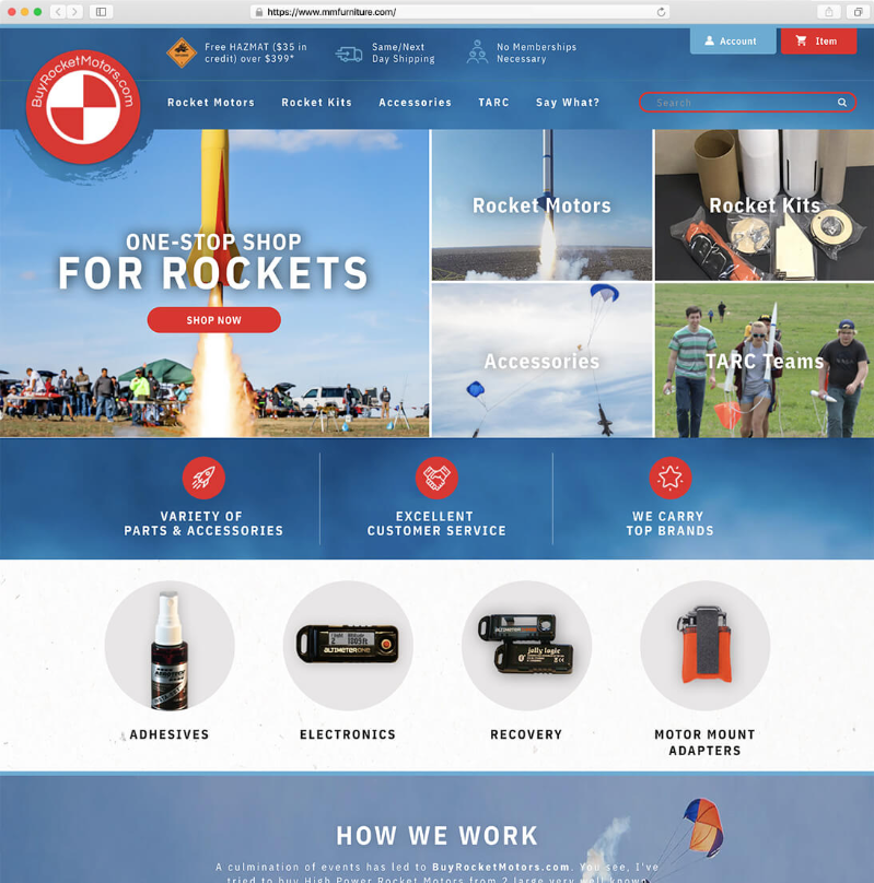
We tend to believe quality is the deciding factor when making a purchase – we want the best for the price. So what makes a good-quality eCommerce website? You might answer with the products, the content, or the information you provide. Yet web design holds a central place in the eCommerce equation. A well-designed, appealing, and usable store goes a long way toward success, and often decides whether a visitor ever becomes a customer at all.
Why does design matter so much? Below we explore the concrete reasons to invest time and care into a quality website design – and what “good design” actually means in commerce terms, which is not the same as “looks pretty.”
It builds trust
It doesn’t matter what you sell or how badly someone needs it – most online shoppers only buy from merchants they trust, and they decide who to trust in seconds. A modern, organized, professional design signals legitimacy; a dated or cluttered one signals risk. Trust cues are specific and worth auditing on your own store: visible security and payment badges, real photography rather than obvious stock, clear return and shipping policies linked from the product page, genuine reviews, and a working, professional-looking design with no broken layout. Each missing cue is a reason to abandon the cart.
Look and feel: design and usability are inseparable
Design and development are directly linked in influencing purchases. A store should look good and be easy to use and navigate. Practical usability work that moves revenue: a fast, forgiving search with filters that narrow large catalogs quickly; navigation that gets a shopper to the right category in one or two clicks; product pages that put price, options, and the add-to-cart button where the eye expects them; and a checkout that is short, with guest checkout and clear error messages. The more friction you remove, the more browsing turns into buying.
Design for mobile first
The majority of eCommerce traffic now arrives on phones, so “the design” effectively means “the design on a small screen.” Tap targets sized for thumbs, a checkout that doesn’t demand pinch-zoom, images that load fast on a cellular connection, and a sticky add-to-cart on long product pages are not extras – they are where most of the money is. A store that looks great on a designer’s monitor but fights the customer on a phone is, in revenue terms, a badly designed store.
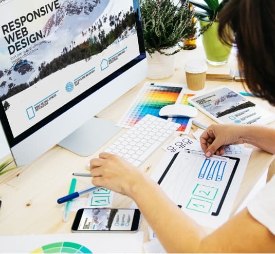
Images and visual merchandising
An eCommerce design is only as strong as the imagery that carries it – photos, video, infographics, and graphs. Customers can’t hold the product, so visuals do the persuasion: multiple angles, zoom, scale and in-context shots, short demo video, and size or comparison graphics that pre-empt the questions that otherwise become returns or support tickets. Strong, descriptive imagery is also read well by search engines when paired with accurate alt text and product copy, so good visual merchandising compounds with SEO rather than competing with it.
It carries the brand
Design is where your brand becomes tangible. Consistent placement of your logo, color system, type, and voice builds the familiarity that turns a one-time buyer into someone who recognizes and returns to you – the same instant recognition an established chain earns from its colors and logo. A coherent visual identity across the storefront, packaging, email, and ads makes every marketing dollar work harder because each touch reinforces the last.
Design and conversion: make it measurable
The reason design matters is ultimately a number: conversion rate. Treat design as something you test, not just admire. Run A/B tests on the elements that carry the most weight – the product page layout, the call-to-action, the checkout flow, the homepage hero – and let data, not opinion, settle disagreements. Use session recordings and heatmaps to see where shoppers hesitate or drop, and fix those specific points. “Beautiful” is subjective; “this layout converts 12% better than the old one” is not, and it is the only definition of good design that pays.
Bringing form and function together
You can have a beautiful site that doesn’t function, or a functional site that looks dated – both leave money on the table. The win is the combination: a store that looks credible, works effortlessly on a phone, merchandises with strong visuals, carries the brand consistently, and is continuously tested against conversion. That is what ties every other marketing effort together, because all of it – SEO, ads, email – ultimately lands on a page whose design decides what happens next.
The cost of bad design, in concrete terms
It helps to make the stakes specific rather than abstract. A confusing navigation forces shoppers to use site search; if that search is weak, they leave – and on large catalogs internal search users often convert at a much higher rate than browsers, so a poor search experience is one of the most expensive design failures a store can have. A checkout that asks for an account before purchase is a well-documented driver of cart abandonment. Slow-loading product images on mobile push shoppers away before the page is usable. Stock photography that obviously isn’t your product erodes the trust the rest of the page is trying to build. None of these are aesthetic complaints – each is a measurable leak in the funnel, and each is fixed with a design and development decision, not a discount.
Accessibility is part of good design
Designing for accessibility – sufficient color contrast, keyboard navigation, descriptive alt text, readable type sizes, and clear focus states – widens your addressable market and improves usability for everyone, not only shoppers using assistive technology. It also overlaps heavily with SEO and mobile usability: the same structure that helps a screen reader helps a search crawler. Treating accessibility as a core design requirement rather than a late add-on is both the right thing to do and a commercially sound one.
Design is never “done”
One last principle: a store’s design is a living system, not a one-time project. Shopper expectations, devices, and competitor benchmarks move every year, and a design that converted well two years ago can quietly decay. The merchants who win treat design as an ongoing program – regular usability review, continuous testing, periodic refreshes informed by real behavior data – rather than a redesign every few years followed by neglect. That cadence is what keeps the storefront aligned with how people actually shop now.
For help building the online store you envision – with the functionality it needs to attract visitors and turn them into customers – see what 1Digital® Agency has done for design clients. We partner with the top eCommerce platforms and build custom design solutions that pair look and feel with measurable performance, and we can amplify them with brand and logo design. Contact 1Digital® Agency at info@1digitalagency.com or 215-809-1567 to start a custom website design plan.