In our previous blog post Hover Effects Part I: More than Meets the Eye we discussed the functionality and aesthetic advantages that hover effects can bring to a web design project. While this is a great starting point for discussion, how do hover effects enhance an eCommerce website? In addition, how will force touch change mobile design and usability?
HOVER EFFECTS FOR ECOMMERCE
The advantages of hover effects for desktop eCommerce can be categorized by functionality, aesthetics and branding. The ways hover effects enhance the user experience and conversion rate is nearly as diverse as the number of hover effects available.
FUNCTIONALITY
- lowers the amount of clicking
- showcases price and availability
- shows ratings and reviews
- can be used to unpack icons that link wherever
- helps customer scan products faster by staying on one page
- drop down menus include many product categories and items for quick navigation
- scroll through product views
- reveals different angles of a product ex: front and back
- zoom for image details
- reveals the contents of your shopping cart
AESTHETICS
- hides product information, reviews etc. to maintain a clean design appearance
- sleek and sophisticated looking
- the look and change of hover effects can add a unique branding experience
- can elicit an emotional response in customers
While the applications of hover effects for eCommerce are endless, it should be noted that some of these features get lost in translation from desktop to handheld devices. Let’s examine the current mobile eCommerce experience and how it may change in the near future.
THE MOBILE EXPERIENCE
Hover effects by definition do not work on mobile and tablet because it’s not possible to hover. Your only option is to tap (once or twice) or press down to create a change.
So although hover effects do not apply to mobile, on-screen changes are still possible on newer websites through tapping or holding. Check out how the hover effects on EMODA ’s desktop site appear on mobile:
1. On EMODA’s eCommerce mobile version you must finger tap once (instead of a hover) to access a highlighted black rectangle around the product. If you click twice or select the “magnifying glass” it will take you to another screen with item info.
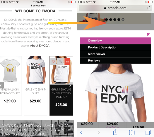
2. Again, in order to enact change, you must use a single tap to see the the black rectangle (instead of a hover). A double tap will reveal a list of options:
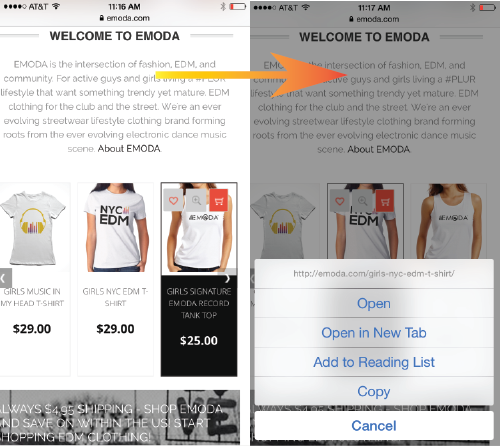
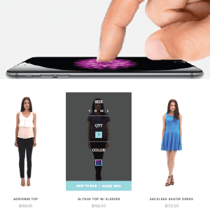
The extended tap in example 2 is closely related to the latest technology called force touch. Force touch works by using sensors, or tiny electrodes, to measure how hard a user is pressing on the screen, whether it be a laptop, mobile or watch.
Force touch has two modes: soft and hard. While an extended hold brings up a list of options in example 2, force touch works by reading soft touch as a tap and “hard touch” as a trigger to a desired destination.
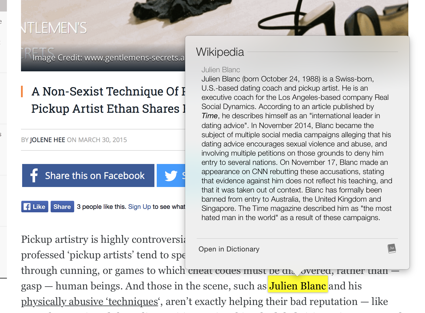
A practical application of this would be hard touching a single word to pull up its encyclopedic definition (see example below) or hard touching an address to have it already pulled up in Google Maps. For mobile eCommerce, I predict that with hard touching a customer will be able to add a product to their cart or even fly right to the check-out page.
Force touch will save seconds in navigation and can potentially simplify the eCommerce mobile experience. Ultimately, because eCommerce and web usage are moving to mobile, it may eliminate the use of hover effects all together. What uses can you think of where force touch can improve the mobile eCommerce experience?
Where this prediction landed — and the durable UX lesson
Editorial note: this article speculated that Apple's Force Touch / 3D Touch would reshape mobile eCommerce interaction. In practice Apple removed 3D Touch from iPhones (replacing it with the lighter, software-based Haptic Touch long-press, and dropping pressure sensitivity entirely from 2019 onward), and the industry never standardized pressure-based commerce gestures. The specific bet did not play out — but the underlying UX principle the article is really about did, and that is what is worth keeping.
The real subject here is not Force Touch; it is how to deliver the information hover reveals on desktop when the device has no hover state. That problem is permanent because mobile is now the majority of eCommerce traffic. The patterns that won are not pressure gestures — they are these:
- Show, don't conceal. The biggest desktop-to-mobile mistake is hiding price, ratings, or "add to cart" behind an interaction. On mobile, surface them by default in the product card. Discoverability beats elegance.
- Tap targets and quick view. A single tap should open a lightweight quick-view or go to the product, with comfortably sized touch targets (a finger is far less precise than a cursor). Avoid requiring a precise double-tap to reveal essential information.
- Galleries replace hover-to-rotate. The desktop "hover to see the back of the product" becomes a swipeable image gallery with visible dots — the information is the same, the affordance is touch-native.
- Long-press is a shortcut, never the only path. Haptic/long-press menus are a fine accelerator for power users, but every action they expose must also be reachable by an obvious tap. Hiding a primary action behind a gesture most users never discover loses sales.
A practical mobile product-card checklist
- Price, primary image, rating, and a clear add/select control visible without any interaction.
- Swipeable image gallery for alternate angles instead of hover-reveal.
- Touch targets large enough to hit reliably on a phone, with adequate spacing.
- Any gesture shortcut (long-press, swipe action) duplicated by a visible tappable control.
- Tested on a real mid-range phone, because input precision and performance differ from a desktop emulator.
What hover still does well on desktop — use it, don't abandon it
None of this means hover is dead on the devices that have a cursor. On desktop it remains a genuinely useful tool when it enhances rather than hides the essential path:
- Secondary image on hover (front-to-back, or product-in-use) speeds scanning without a click — as long as the primary image and price are already visible.
- Quick-add or quick-view affordance revealed on hover shortens the path to cart for decided buyers, provided the same action is reachable on the product page for everyone else.
- Mega-menu category reveal remains an efficient navigation pattern on pointer devices, with the mobile equivalent being an explicit tap-to-expand menu.
The principle that ties desktop and mobile together: hover may accelerate a path, but it must never be the only way to reach essential information or actions. Every store should be built so that a visitor who never hovers and never long-presses can still see price, ratings, and add-to-cart and complete a purchase.
Frequently asked questions
Should I still use hover effects on my store? Yes, on desktop, as an enhancement — never to conceal price, ratings, or the buy action. On touch devices, replace hover with default-visible information and swipeable galleries rather than trying to emulate it.
Do touch gestures like long-press help conversion? They can serve power users as shortcuts, but because most visitors never discover them, any action they expose must also be available through an obvious tap. Treat gestures as accelerators, never as the primary interface.
The lesson outlived the technology: design for the absence of hover by revealing, not hiding. We build mobile-first storefronts on exactly this principle — see our eCommerce web design work or contact us.