Facebook's call-to-action (CTA) buttons let merchants send people straight to a chosen destination without pasting long URLs into post copy. The primary Page CTA sits in prime real estate near the top of your Facebook Page, and CTAs also appear on boosted posts and paid ads. Used deliberately, they turn passive Page visitors into measurable actions. Note up front that Facebook periodically renames and reorganizes these options, so treat the labels below as the intent behind each button rather than an exact menu transcription — the strategy is what's evergreen.
Depending on your goal, the buttons most useful for eCommerce are:
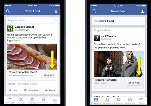
Shop Now — The most direct option for retailers. Link it to a high-intent destination: a best-seller collection, a current promotion or sale section, or your storefront — not your homepage if a more specific page will convert better. If you sell through Facebook/Instagram Shops, this is also where catalog-driven shopping lives.
Contact Us / Call Now / Send Message — Best for considered or high-touch purchases where a conversation closes the sale. "Send Message" opening a Messenger thread (optionally with an automated greeting or FAQ) tends to outperform a static contact page for businesses whose customers want a quick question answered before buying.
Sign Up — Points at an email/SMS list opt-in or event registration. List growth is one of the highest-ROI uses of social traffic, because you then own that audience instead of renting it from the platform's algorithm.
Learn More / Watch Video — For products that need explanation, route to a tutorial, demo video, or in-depth guide. Education-first CTAs work well for technical or premium products where the barrier is understanding, not price.
Match the Button to the Goal — and the Funnel Stage
Choosing a CTA comes down to one question: what is this Page or campaign actually for right now? That changes month to month. A cold-audience awareness campaign is usually better served by "Learn More" or "Watch Video" than by "Shop Now," because asking a stranger to buy on first contact converts poorly. Warm audiences — past visitors, engagers, email subscribers — are where "Shop Now" and "Sign Up" earn their keep. The single most common mistake is pointing every audience at "Shop Now" regardless of how familiar they are with the brand.
Make the Creative Earn the Click
A CTA button doesn't perform in isolation; the surrounding creative has to set it up. Use an eye-catching cover image or post visual whose message matches the button's intent, so the click feels like the obvious next step rather than a leap. Some Pages get creative with cover art that visually points toward the button. Keep the destination promise consistent: if the ad says "20% off boots," the link must land on discounted boots, not a generic catalog — mismatched expectations are the fastest way to waste the click you just paid for.
Measure It, Don't Just Set It
The reason to use CTAs deliberately is that they're measurable. Install the Meta Pixel (and the Conversions API for server-side accuracy as browser tracking degrades) so you can attribute sessions, sign-ups, and revenue to the button and campaign, then use UTM parameters on the destination URL so the traffic shows up cleanly in your own analytics. Without that instrumentation you're guessing; with it, you can see which CTA and creative combination actually drives sales and shift budget accordingly.
Frequently Asked Questions
Should every post have a CTA? No. Purely engagement or community posts often perform better without a hard CTA. Reserve strong CTAs for posts and ads with a clear conversion goal.
Page CTA or ad CTA — which matters more? For revenue, the ad/boosted-post CTA usually drives more measurable action because it can be targeted and optimized. The Page CTA is a useful always-on default.
Where should "Shop Now" point? The most relevant high-intent page — an active promotion or a specific collection — not a generic homepage.
Test One Variable at a Time
Because CTAs are measurable, treat them as something to optimize rather than set once. The disciplined way to do that is to change one variable per test and give it enough volume to mean something. Test the same creative with two different CTA destinations, or the same CTA with two cover images, but not both at once — if you change everything together you'll never know which change moved the result. Run each test long enough to clear normal day-to-day noise, judge it on the action that actually matters to the business (revenue or qualified sign-ups, not raw clicks), then keep the winner and test the next variable from there. A handful of these small, clean tests over a quarter compounds into a meaningfully better-performing Page, whereas a constant stream of simultaneous changes produces motion without learning.
Keep the Destination Experience Consistent
One failure mode deserves its own warning because it silently wastes budget: a great CTA pointing at a weak destination. If the click lands on a slow page, a mobile layout that's hard to use, or content that doesn't match what the ad promised, the button did its job and the page lost the sale. Before scaling spend behind any CTA, load the destination on a real phone, confirm it's fast and matches the ad's promise word-for-word, and make sure the next action there is obvious. The CTA and the landing experience are one funnel; optimizing the button while ignoring where it leads is the most common reason social traffic doesn't convert.
Overall, CTA buttons won't hit your goals on their own — they assist a broader strategy across sales, traffic, list growth, and engagement. You set the intent and instrument the result; the button does its small, useful job. For help turning social traffic into revenue, see our Facebook advertising and social media management services, or explore paid social more broadly.