
At 1Digital® we think of a premium template the way a craftsman thinks of a frame: it gives the work a place to exist, complements it, and never competes with it for attention. A good eCommerce template is a stylish, distinguished home where your products look their best — and, just as importantly, a fast, conversion-minded structure that helps customers actually buy.
Our Shopify web designers have crafted a selection of custom Shopify templates built to do both. Browse our five below — and if you like what you see, view all of our premium custom templates. First, though, it's worth knowing what actually separates a good Shopify theme from a pretty one, because the difference shows up in your revenue, not just your screenshots.
How to Evaluate a Shopify Theme Before You Commit
A theme is a long-term decision — re-theming a live store is disruptive — so judge it on more than the demo:
- Mobile-first, not mobile-also. The majority of Shopify traffic is on phones. Inspect the theme's real mobile layout — navigation, product page, and especially checkout entry — not just the desktop hero.
- Performance. Heavy sliders, autoplay video, and large hero images look impressive and quietly fail Core Web Vitals (Google's public targets: LCP under 2.5s, INP under 200ms, CLS under 0.1 on field data). A fast, plainer theme out-converts a slow, flashy one.
- Conversion features. Look for clean product cards, prominent and persistent add-to-cart, support for reviews and structured data, flexible merchandising, and a checkout-friendly path. These move revenue more than decoration.
- Customizability without code. The more you can adjust visually, the cheaper the store is to evolve and the less you depend on a developer for routine changes.
- Product-fit. A theme that flatters apparel may bury the specs a technical product needs. Match the layout to how your customers decide.
With that lens, here's what each of our templates is built for. (Click images to enlarge.)
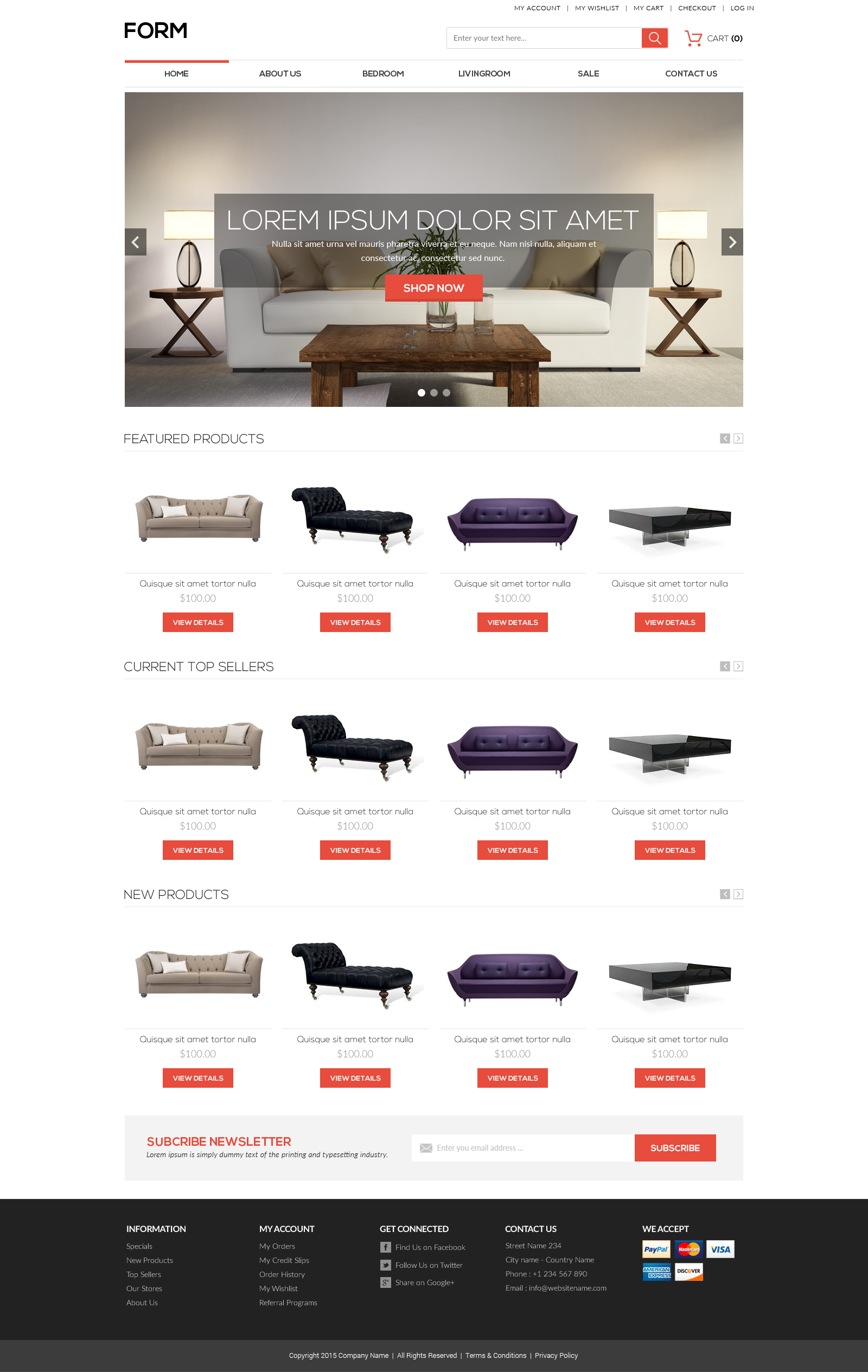
Form
Form is minimal but powerful. It uses color sparingly to guide navigation and a neutral, highly readable typeface, which makes it the safe, versatile choice when your catalog is broad or your products vary widely — restraint here keeps the focus on the product and tends to keep the page light and fast.
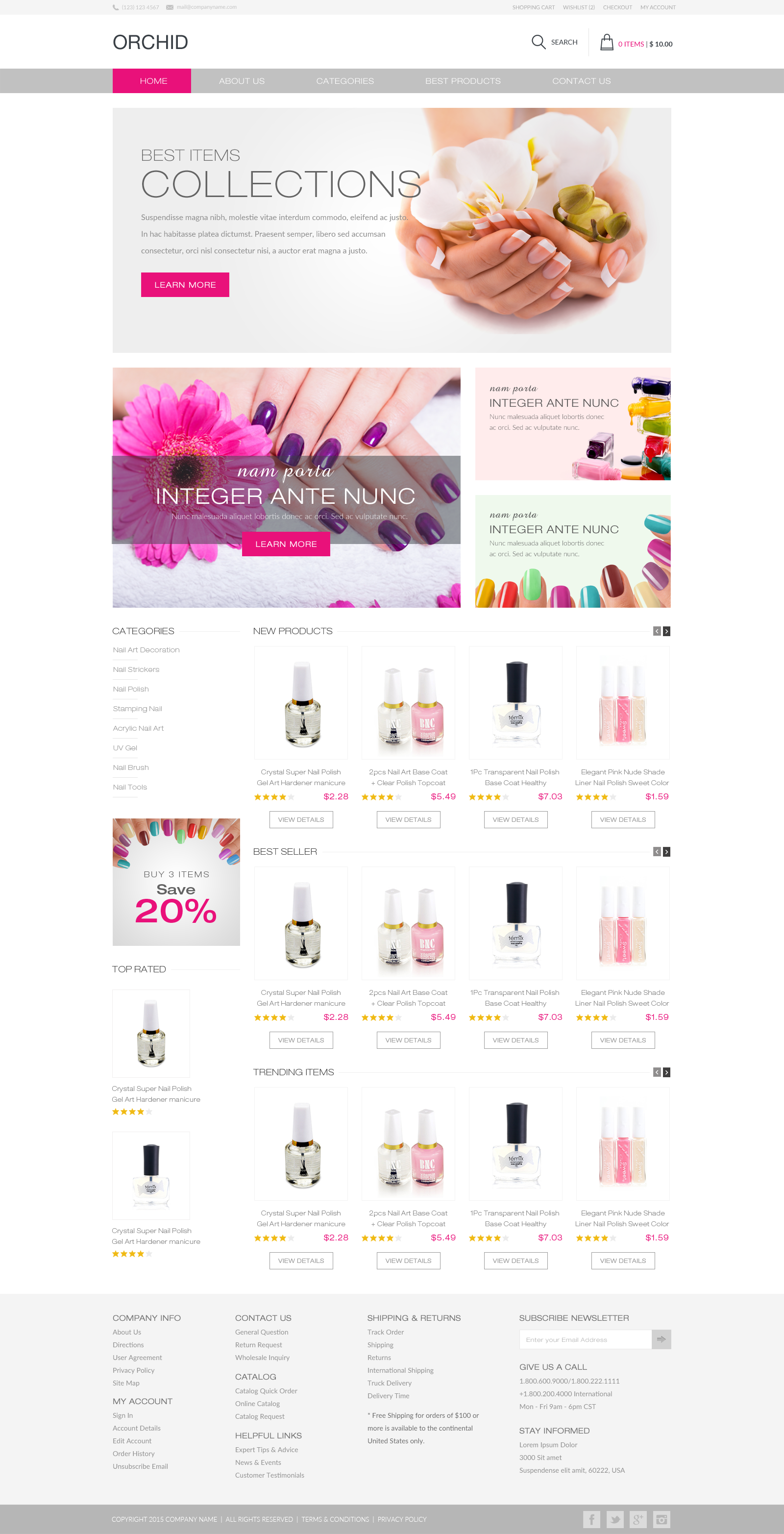
Orchid
Orchid keeps Form's neutral versatility and adds a controlled splash of color and more expressive navigation. It suits a brand that wants personality without sacrificing the wide-product-range flexibility a minimal base provides — the color is there to direct attention, not to shout over the products.
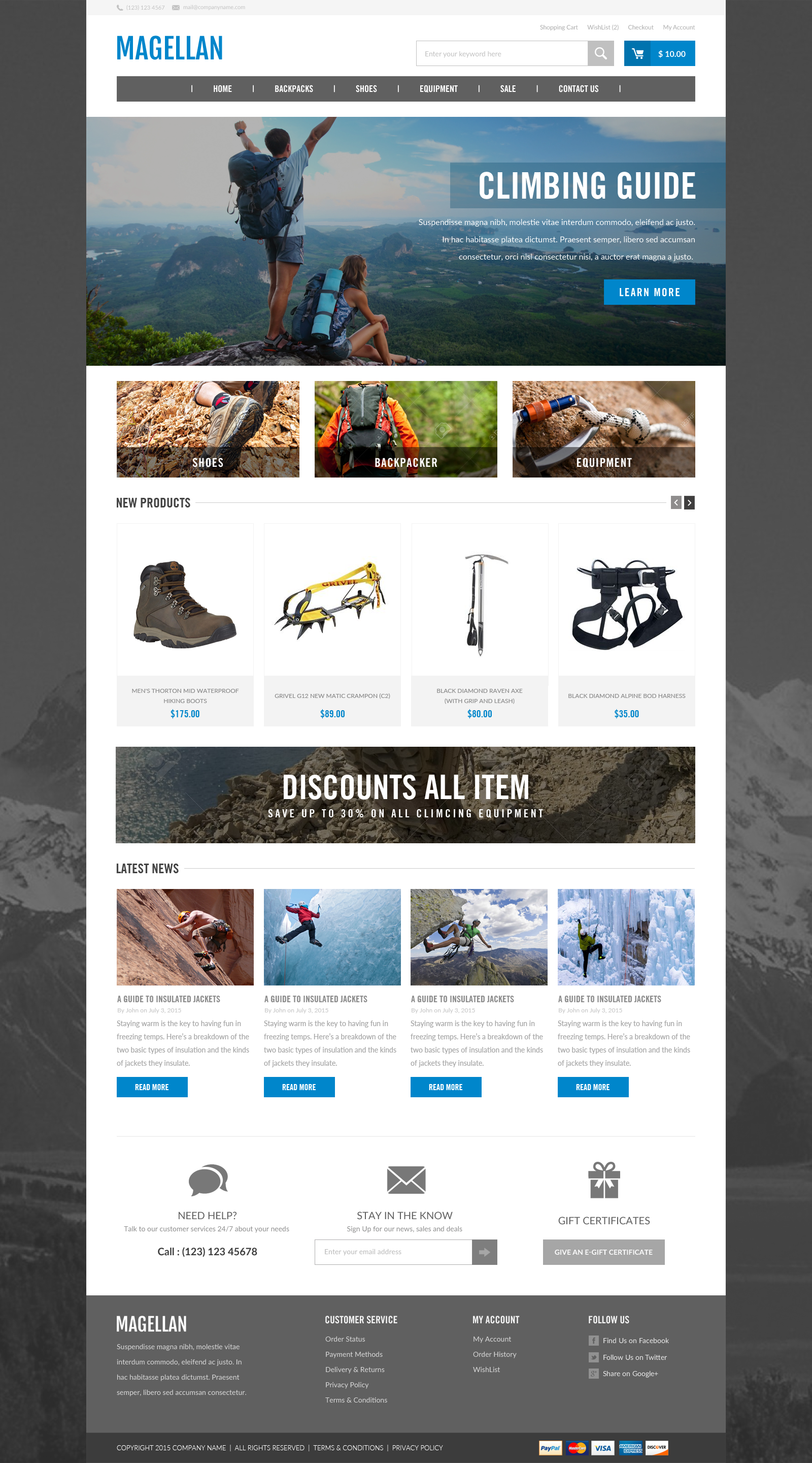
Magellan
Magellan's layered pages create a feeling of depth and use imagery to sell aspiration — where the product can take the customer. It's tailored toward conversion for lifestyle and experience-driven brands where the story around the product is part of the sale.
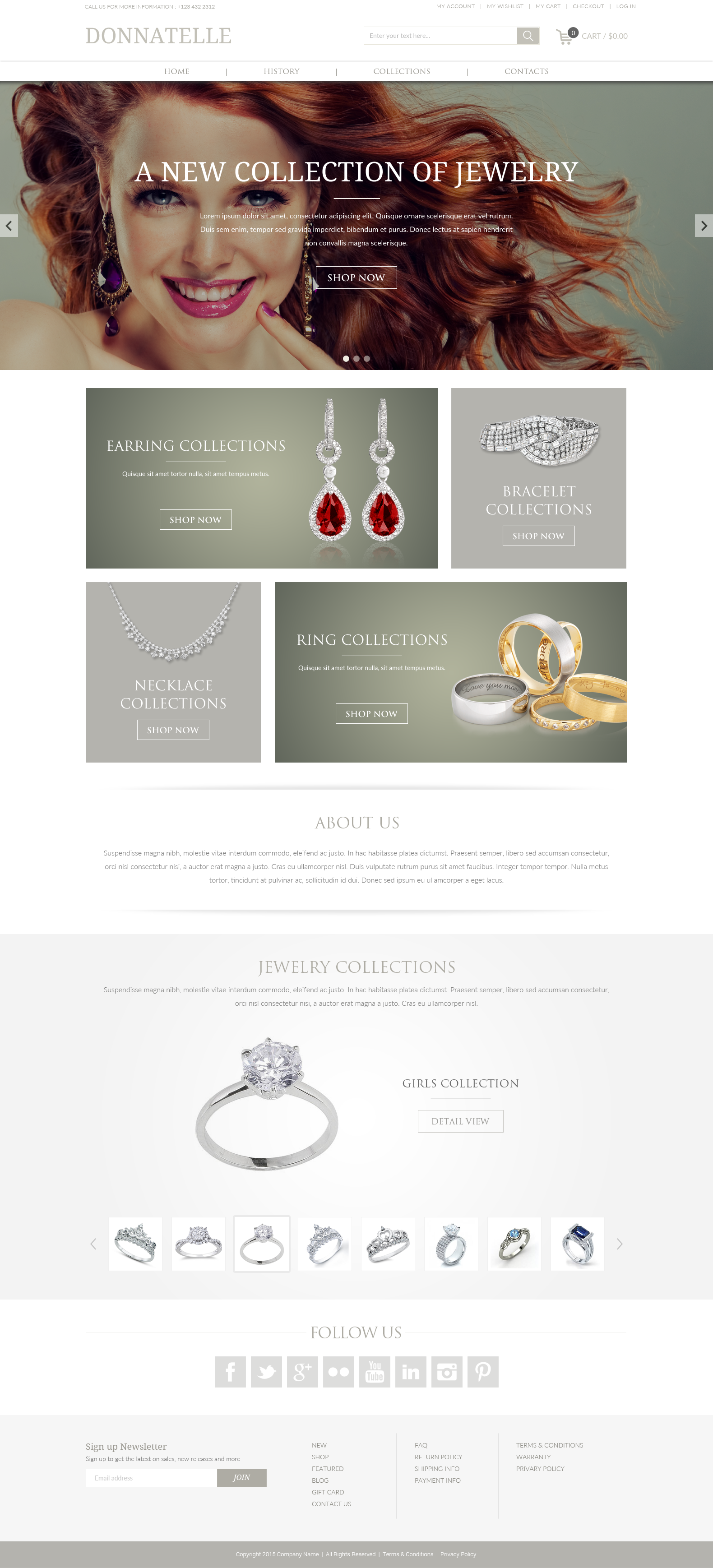
Donnatelle
Donnatelle's polished surfaces, large high-resolution imagery, and muted text are made for products that need to look premium — jewelry, design objects, beauty. Prominent social integration helps a visual brand extend past the storefront into the channels where it gets discovered.
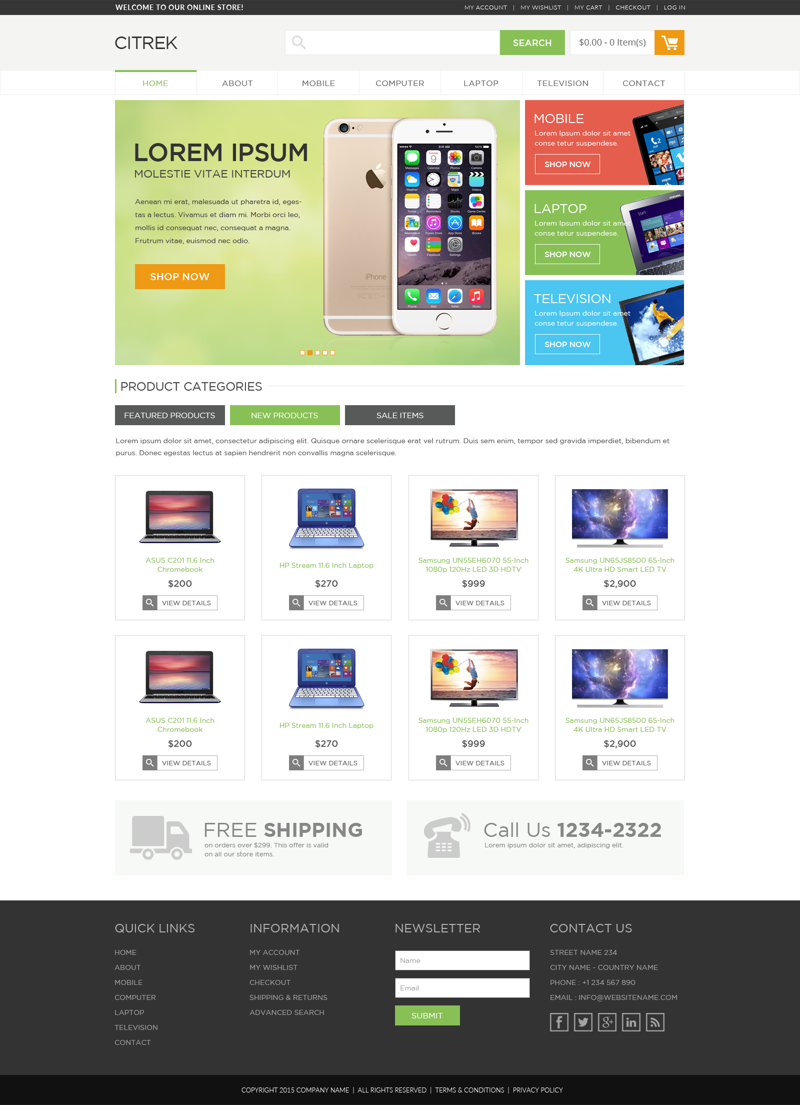
Citrek
Citrek is bright and sociable, engaging from the first moment, with conspicuous color and clean lines suited to products that have a sharp design element. Its built-in footer newsletter tool turns first-time visitors into a list you own — a practical, revenue-relevant feature, not just an aesthetic one.
Matching a Template to Your Catalog
Notice that the five above aren't ranked best-to-worst — they're built for different jobs, and the "best" Shopify template is the one that fits how your customers actually decide to buy. A few honest matching rules. If your catalog is large and varied, a restrained base like Form keeps every category coherent and the pages light. If the brand needs personality but the range is still broad, Orchid adds expression without losing that flexibility. If the purchase is aspirational or experience-led, Magellan's depth and imagery do real selling work. If the product must look premium and visual, Donnatelle is built for that, and if list-building and a high-energy first impression matter to your model, Citrek's footer capture is a revenue feature, not decoration. The mistake is choosing on demo aesthetics alone and discovering later that the layout buries the information your shoppers need to commit.
What to Do After You Pick a Theme
Selecting the template is the start. To protect the investment: customize on a duplicated theme so the live store is never a work-in-progress; replace demo content with real, optimized product imagery and copy (a great theme with placeholder content converts like a placeholder); re-test Core Web Vitals on the real catalog, because your images and apps — not the demo's — determine the actual speed; and check the full mobile path through to checkout before launch. A theme is a frame; it only performs once the right work is hung in it and the gallery is built to be walked through quickly.
Theme First, or Custom Build?
A well-chosen premium template is the right call for most stores: faster to launch, cheaper to maintain, and proven. A fully custom build makes sense when your merchandising, content, or operational requirements genuinely can't be met within a theme's flexibility, or when the brand needs something no template can express. The honest test is requirements, not taste — start from what the store must do, then decide whether a template can do it.
No matter what you sell, there's a template that will be the right home for your products — see the full set of premium custom templates. If you'd rather build from the ground up, our Shopify web designers and developers can create a fully custom site. Get in contact and bounce your ideas off us.