John Stortz & Son, operating from Stortz.com, is a provider of reliable, durable tools for a variety of tradesmen. For over 150 years, Stortz has been a leader in their industry; their catalog contains high-quality highlights in sheet metal and slate roofing tools, among countless others. It’s surprising how much eCommerce web design impacts their business.
Stortz, like so many other businesses, has been profoundly impacted by the drastic shift in consumer behavior that has sent so many shoppers flooding into the digital marketplace. Industries that might have been considered as staples of brick and mortar are becoming increasingly buoyed by online sales. Stortz is no exception.
These factors no doubt influenced Stortz’ decision to partner with 1DigitalⓇ Agency for a variety of eCommerce web design and development items beginning in September 2020. With more and more customers entering the virtual doors, offering a quality online shopping experience has taken on a role of central importance.
Originally, Stortz’ partnership with 1DigitalⓇ Agency centered around our abilities as an eCommerce design agency. The client website is built on WordPress using WooCommerce, and our website design team’s experience with these platforms brought Stortz.com into the new age. We redesigned their homepage with an updated mega menu, new category blocks with enhanced imagery and a featured products section, all of which were intended to provide the website with an updated appeal to improve the user experience (UX) and boost conversions.
Making Ongoing eCommerce Web Design Improvements
Both our client, John Stortz & Son, and their customers benefited from these preliminary eCommerce design and website development improvements, but Stortz.com kept 1DigitalⓇ Agency on as a strategic partner with a retainer agreement.
In the months that followed the original redesign of their homepage, it wasn’t long before the team at John Stortz & Son started noticing additional improvements that could be made to their eCommerce web design. In addition to making sundry improvements to their homepage banners, and mega menu, the client realized that there were improvements to be had with respect to the checkout experience.
According to Statista, nearly 90% of online shopping carts are abandoned before they can be converted into a sale. If you are to trust their figures, an average of 88% of all online shopping carts are ultimately abandoned. The features affecting these statistics are many, but invariably they stem from customer expectations.
Either the customer gets waylaid by hidden fees, frustrated because there are too many steps in the checkout process, or doesn’t know how to proceed. Whatever the case, the end result for the business in question is unpleasant; they lose out on a sale.
Stortz.com’s checkout process (an integral feature of their eCommerce web design) gave no overt preliminary cause for concern, except for the fact that the cart itself, the collection of information and payment, and the confirmation were all displayed on separate pages.
One of the biggest pushes in eCommerce today is to deliver a checkout experience that is as pain-free as possible. To put it lightly, every step is a very large temptation for online shoppers to bounce or abandon their carts. This is also one of the reasons that the “one page” or “one click” checkout has become a matter of such focus in eCommerce. The more steps, the higher the chance of abandonment. Stortz’ checkout process had three separate pages.
Our eCommerce designers, with collective decades of design experience, know firsthand just how great of an impact factors like this can have on UX and on conversion rates. Our team redesigned and developed a new checkout page for John Stortz & Son in which all three pages were merged into one, as displayed below.
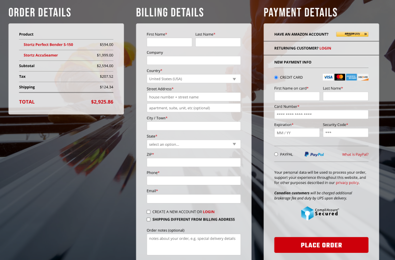
This updated checkout design reflects a process that is much more streamlined and presents shoppers with as few changes to fail to convert as possible. Interestingly enough, though we only recently concluded this aspect of their web development project recently, their team has already seen a marked improvement in user behavior – specifically conversions.
Concrete Results: Boosting Conversions
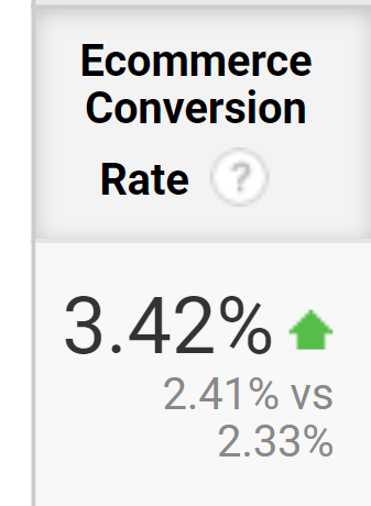 Only a few short months after implementing these changes, Stortz.com experienced some upticks in conversions. As you can see below, the conversion rate improved by about 3.4 since we concluded this portion of the project. To be specific, the data to the left shows the increase in overall conversion rate (among all users) comparing the time since we concluded the redesign of their checkout page in June 2021 through the present time (August 2021) as compared to the previous period. It is a steady but positive increase.
One of our client contacts at John Stortz & Son was not surprised by the positive effect this seemingly simple improvement had on user behavior. When asked if he expected a change to the checkout experience to have such a marked impact, he replied simply, “I did.” elaborating that the checkout experience is “one of the most important things for user experience. It’s paramount to the checkout process. It needs to be fast, secure and clear. I wish we would have done this years and years before.”
He also added, “The conversion rate increase has been the most important metric there is. Getting people to your website is important but you also need to be able to get them to convert. Any change you can make to improve conversion rate is vital.”
Interestingly, when asked what group of shoppers was most likely to be positively affected by the change in checkout experience, our client responded unhesitantly with, “Mobile traffic. Shoppers checking out on mobile devices need to have to make as few clicks as possible.”
There’s no arguing with that, because it’s true. Mobile shoppers constitute an increasing majority of overall online shoppers, and they are consistently intolerant of click-heavy, multi-page processes – not just with the checkout experience.
Interestingly enough, John Stortz & Son is investigating moves to make improvements to their site design that will directly impact the experience of the mobile shopping experience for the better.
Projected Account and Mobile Improvements
Currently, our client is interested in making potential improvements to their website with respect to their My Account section that would display specific account information as a series of badges or portals that could be expected to have a marked positive impact on the user experience.
Features such as “Addresses,” “Orders,” “Payment Methods” and other “Account Details” would all be navigable through a series of portals or badges on a single page, streamlining and enhancing the navigation experience and significantly condensing the process, eliminating a lot of back and forth clicking and scrolling. For mobile shopping specifically, this could be expected to be received as a significant improvement.
In an online marketplace in which over 70% of shoppers are understood to shop via mobile devices, any step in the direction of mobile optimization is a good one.
Stortz’ partnership with 1DigitalⓇ Agency as an eCommerce website design and development company is ongoing and only expected to become more fruitful as time continues. These results are not atypical of our eCommerce site design and development projects or our digital marketing services. They’re born out time and time again through our eCommerce case studies.
To learn more about our services as an eCommerce design agency, get in touch with our specialists today. You can reach us by phone at 888-982-8269 or at info@1digitalagency.com.