Psychology of Web Design Part I

COLOR
The idea that color can produce an emotional response to the viewer, is a widely accepted concept in psychology. Furthermore, this concept can be applied to marketing and used effectively in branding and web design. Colors can be a powerful tool. Therefore, the ones associated with your brand and website can influence a consumer and visually communicate a lot about your brand. Let’s take a look at the most commonly used colors to see what they are really saying:
Green
- nature, plants
- positive attitudes including calmness, comfort and rejuvenation
- light shades environmentalism and organic
- darker shades can denote money, wealth and finance
- Example: www.wholefoods.com
www.citizensbank.com
Red
- passion, power and aggression/excitement
- bright reds for energy or youth
- dark reds for lasting services or products
Pink
- youthful femininity (much like bright reds)
- comfortable and delicate
- elegance and luxury
- Example: www.narscosmetics.com
Orange
- balanced and neutral
- cheerfulness and excitement
- shows creativity and sense of uniqueness
- Example: www.ingdirect.com
www.nick.com
Blue
- trustworthy, secure and honest
- very calming like water
- light blue is friendly
- Example: www.navy.com
https://twitter.com
Yellow
- most exciting and energizing/stimulating
- sun, sunlight and happiness
- great for children
- darker shades: antiques and wisdom
- Example: www.sesamestreet.org
Purple
- royalty, power and wealth
- dark shades are complex and elegant
- light shades are romantic
- Example: www.ralphlauren.com
Black, White and Gray
- modernity and sophistication
- most popular colors for fashion and interior design
- can also be traditional and serious
PLACEMENT & LOCATION
Borrowing from the laws of Gestalt psychology, web designers can successfully employ these principles in relation to the placement and location of certain items. Let’s take a closer look at these laws below.
Law of proximity: Things that are close together are related.
Law of similarity: Similar things are assumed to be related. You can denote this with color, for example.
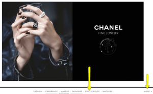
Law of closure: Showing part of something so the mind “closes” them. This may be useful to employ in your homepage’s header. Perhaps your header ends in an arrow shape denoting that there is more information below. This can encourage the visitor to scroll down. Or maybe the navigation sits below the photos, hinting that there is more writing to see. Click to see example below:
Law of symmetry: Things should be symmetrical. When designing forms, you should create symmetry as to not confuse the user.
Law of common fate: People perceive elements to be doing the same thing. So if a product has a hover over effect and pop-out, then every product should also have this.
Law of continuity: If one thing is aligned with another they must connect. For example, a button needs to take you to the service or product being offered.
Law of past experience: If you have multiple pages that serve the same function, then they must all look and work the same way.
Here at 1DA, our web developers are very familiar with designing websites that employee the psychological techniques of color and placement of information. If you are interested in creating a new website or would like to change your current website, visit our Custom Website page or Redesign / Makeover page today.