
How Microcopy Improves Branding & UX
Dan Kogan
- July 14, 2016

Writing strong copy for your website, blog, and newsletter is essential to establishing your brand. Website copy is your greatest asset to directly impact potential customers visiting your website and persuade them to continue learning about your business. Longer copy allows for a vivid explanation of your product or service, but there is also a need for copy in website navigation. This addition allows you to enhance the user experience (UX) as well as provide a subtle yet powerful opportunity to build a unique brand voice.
Microcopy is the text developers and writers often forget to consider when building a new website. You can find microcopy in navigational labels, form fields, instructional text, call-to-action (CTA) buttons and many other intricacies of your website. Typically an afterthought of website production, these short bursts of information can help alleviate user error as well as turn a negative UX such as an error message into a positive brand building experience. Ironically, the smallest bits of copy can have the biggest impact.
Stay direct
It’s called microcopy for a reason. Make sure your language is unambiguous and as direct as possible. There is rarely a need for multiple sentences when guiding the user through a single task. Writing for people mean labels should be in simple language, without technical jargon. Tell the user what to do by labeling buttons with the action the user is completing when clicking.
Help when the user hurts
If the user encounters a problem (of their own making or the website) it will be helpful to know exactly what happened and how to fix the issue. If the user can’t log in, they already know there is a problem, however without account recovery guidance an error message can be frustrating or perceived as a taunt.
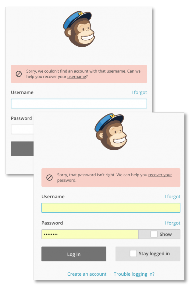
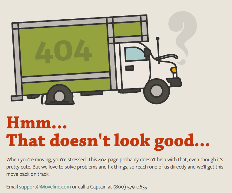
Error messages are an unexpectedly powerful opportunity to establish your brand’s voice. For example, you find a 404-error message when a web page is unavailable. This can either be a failed and frustrating element of your website’s UX, or a branding opportunity to brighten the user’s perception of the minor hiccup.
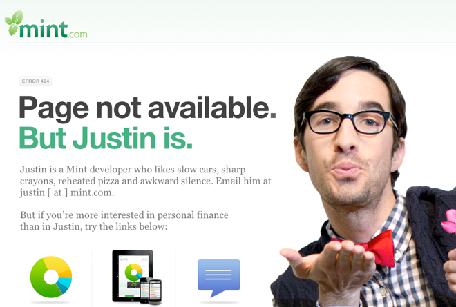
Always tell the user what is wrong and how to fix the issue. Instead of “The website you are looking for cannot be found” use humor, shared confusion, sympathy, or other emotional tactics to connect with the user.
Avoid over-branding copy on:
– Navigation
– Forms and field labels
– Instructional text
– Selection text (drop-downs)
– Buttons
Consider your brand’s voice in:
– Confirmation messaging
– Rewards
– 404 pages
– Server errors
– Error messaging
Clarity is essential in the first list for it is when the user is attempting to take action and accomplish something on your website. Confusing branded quips may push the user away.
The second list is the result of the action. At this point you don’t need anything from the user so aside from basic guidance, you can import as much of your branded voice as you deem fit.
Get to know your user
Every industry has a certain amount of internal terminology that is alien to the average consumer. This may sneak into your website’s navigation or labeling without you realizing how confusing it may be for the user. You should already be conducting usability testing, and if you’re not there are plenty of articles online detailing this missed opportunity.
Assuming you are already testing your website, you have likely been focusing on the user’s facial expression and watching how the user interacts with your website. However instead of just watching, make sure to listen to – and take notes on – the specific words of the user. This should be simple since you’ve told them to think out loud. Listen to the inflection of the user’s voice as they read microcopy, did they have an inquisitive tone as they read the navigational labels?
Much as an interviewer may judge an applicant based on their interaction with the secretary, listen to your tester before as well as during the usability test. Notice what words are used to express frustration or enjoyment. You’ll be surprised how much you can learn about a user and their language from simple comments outside of the official test.
Reduce suspicion
Microcopy can help overcome the doubt’s a user may have about registering, subscribing, or buying into your product or service. You should anticipate a user’s question before it is asked.
Spam Scare
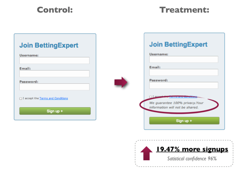
Good marketers value consumer trust above social media followers. While this should go without saying, many users have either been duped into releasing control of their account or have seen automated messages spammed under the accounts of their friends.
If you’re asking the user for their email to sign up for a newsletter let them know you’ll avoid sending spam messages to their inbox. The same principle applies to selling their contact information, so long as you backup this claim with your actions (or lack thereof in this example).
Is that info really necessary?
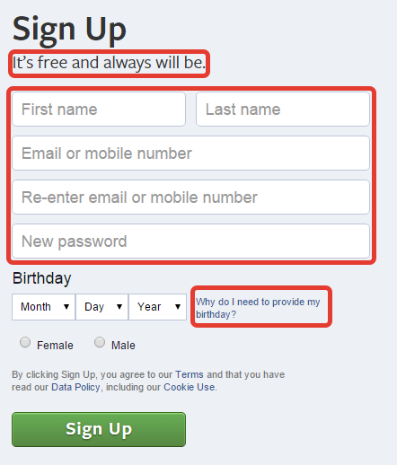
Facebook tackles user concerns head-on in this signup form. By telling you in advance that the service is free (and always will be) user concerns can be alleviated, perhaps before they even develop. It also explains why the form asks for your date of birth. These neutralize any potential fears of the user, as well as reduce any potential input problems the user may encounter.
Small Changes & Big Impact
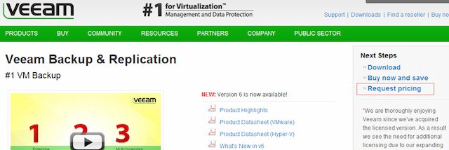
You should never be fully satisfied with your website for if you are, you’re missing out on even greater potential. Usability testing assesses the what aspects of your website are clearly understood, and those that confuses the user. As explained on UXPlanet.org, Veeam continued to notice users asking for a price via the on-page survey.
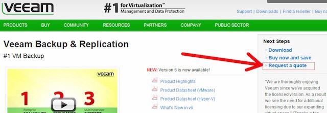
When they tested changing the microcopy from “Request a quote” to “Request pricing” Veeam noticed a 161.66% increase in clicks to their lead generation form.
Usability testing is a great way to spot glaring issues of your website’s UX design, however for more frequent analysis apply A/B testing. This will allow you to consistently increase your website’s effectiveness. Well-written microcopy guides the user to their destination in an enjoyable and/or intuitive way, whereas poor microcopy can frustrate and confuse the user. If you’re looking to update your website reach out to 1Digital Agency’s team of writers specializing in content marketing and website copywriting. Don’t be deceived by the size of microcopy, for it can make or break your website’s UX.
Dan Kogan


